
.svg)

I designed an end‑to‑end dashboard experience with an emphasis on clarity, structure, and scalability. The work began by defining the primary user goals (monitor performance, identify risk/opportunity, and drill into details quickly) and translating those needs into a layout built for scanning and comparison.
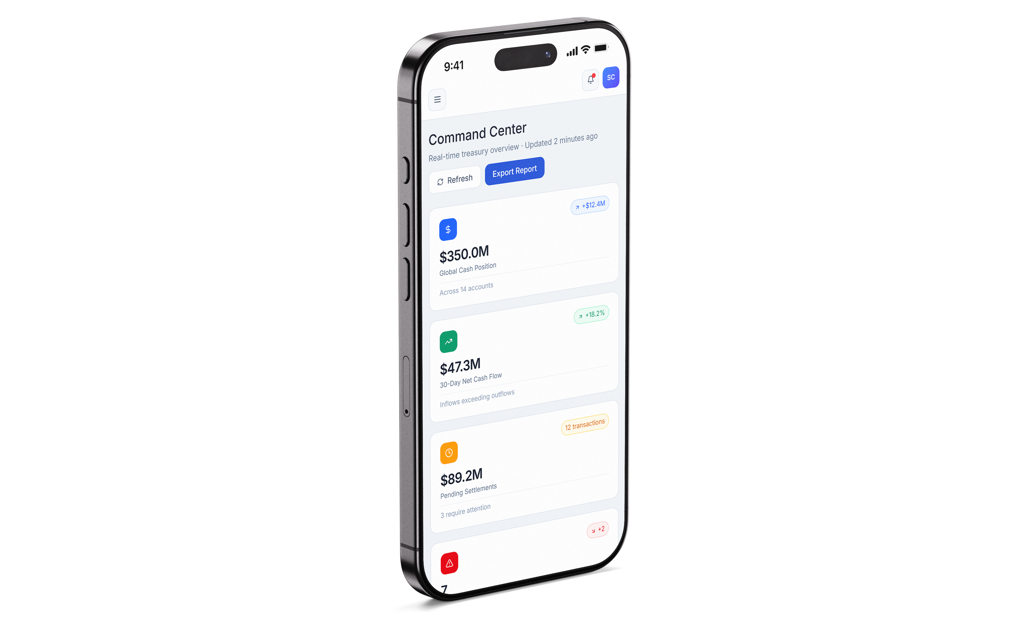
From there, I developed the information architecture and core page structure—prioritizing high‑value metrics, predictable navigation, and a consistent content rhythm that helps users orient themselves at a glance. I explored multiple layout directions to balance density with readability, then refined the system into a set of reusable components for charts, tables, filters, and status indicators.
To support real‑world dashboard behavior, I designed key interaction patterns such as filtering, sorting, drill‑downs, and multi‑state components (e.g., loading/empty/error). Visual decisions—typography, spacing, color, and emphasis—were used intentionally to improve comprehension, highlight change over time, and reduce distraction when users are working quickly.

The final concept is a modern fintech dashboard that feels premium, structured, efficient and designed for users who need both high‑level insight and fast access to detail. The interface establishes a clear hierarchy, supports predictable navigation, and uses a scalable component approach that can expand to new views and data types without losing consistency.
This case study demonstrates my approach to product‑oriented UX/UI work: framing a problem, designing for user goals, building systems that scale, and making dense information easier to interpret through intentional hierarchy and interaction design.


